Some of the posters for the film work really nicely and others don’t really tell the tale of the story. I much prefer the top center poster compared to the middle line of posters as I think it’s a really serious film and the illustrative vector based images and posters really don’t suit it as well as the other more photographic approaches. I also like the poster to the left as I think it shows quite a lot about the movie and shows Nina Sayers in a different approach to first thought of. I think my poster will have to be very serious yet still approachable.
Thursday, 19 January 2012
Egon Schiele - Illustrator
Egon Schiele
I like the illustration work Schiele produces. I think even thought the work is over 80 years old, the style is really coming back into the current market. A lot of the ‘mark making’ like designs are being used increasing more. I really like some of the effects his images show and the childlike friendliness of the images. I enjoy working with line drawing and continuous lines as I think they give a really nice effect.
Thursday, 12 January 2012
AD207- Work Based
For AD207 work based learning I have decided to do a live brief for the magazine cover of little white lies. The live brief is from D&AD and is running throughout 2012 and the deadline is Friday 9th March. The brief is to create a magazine cover depicting the main character from one of the top five films in 2011. The films that I have to look at include Drive, Black Swan, The Tree of Life, Super 8 and Tinker, Tailor, Soldier, Spy. I will have to do some research into these five films and get some general knowledge of the film as well as getting a character profile of the main characters in the films.
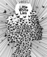
Looking at the images above which are previous magazine covers for the Little White Lies magazine and most of them seem to stick the same guide lines. The covers above are nearly all the same with facial shots of the main characters portrayed in an illustration. Some of the illustrations are a lot simpler than others with the first image uploaded being mixed media and the last being a very detailed pencil lined portrait. The fact that there are so many different previous outcomes that are made from entirely different medias really excites me and the fact that the project is basically open to all aspects.
Tuesday, 10 January 2012
Digital Skills
Creating my Portfolio website...
What is the purpose of the website?
The purpose of my website will be to showcase my work to hundreds of people online. It will be an online diary of what I am doing within the graphic design world and will show the best of my work and have a range of different tasks that I have had to create. The website will include a lot of pieces of design that I have created including stationary sets, posters, logos and many other things. However the purpose of the design is not just to showcase my work to other graphic designers but also to show that I can also create a website, and to show my work to potential customers.
How many pages would you like? What do you want to put in these pages?
I think my website will include four main pages that then run off into different category’s but I don’t want to make my website too over powering and would prefer to keep the design as simple as possible. In my portfolio website I will consider using three or four pages including an about me page, a page with my portfolio and an overall / homepage.
Who is the target audience?
The target audience for my portfolio website will be small companies and businesses looking for design work. My work will specifically be aimed in an illustration directed format so the target audience will be people looking for illustrative design so the audience will be people that are more modern and up to date with there designs and my target will be to stay away from more corporate businesses that stick to strict rules and regulations. My portfolio will have to be appropriate for illustration based design companies so that if I was to apply for a job I could include my portfolio website.
Do you want some interactivity?
I would like a certain amount of interactivity on my website for people to be able to be directed to my email if they wanted to ask any questions. I would consider using a twitter feed and creating a design based twitter.
Monday, 9 January 2012
Portfolio Websites
www.jessewillmon.com
Initially you are introduced to the designers website with a very illustrative based design. The design is a little bit all over the place but I do really like the idea of it. I like the style of the designs and the free hand sketches. However I do think the design of the website could be improved by making the whole website just a little bit more professional. I do like the navigation bar on the portfolio itself and I think it looks very approachable and user friendly.
Lucian Portfolio
http://kevinlucius.com/
An online portfolio that i have looked at to get some inspiration for my own portfolio.
I really like the layout and simplicity of this portfolio. I think the layout of the work really works well because it is very easy to see and if you want to look at the work in more detail it is easy as all you have to do is click on the image and it opens it up in a 'light-box' effect.
Subscribe to:
Comments (Atom)


