

Tuesday, 12 April 2011
Design Event Talk
Time Plan 12th - 13th April.
Tuesday AM:
Start looking at designs and names for the new rebranding of space.
Do some name generation tasks
Start working on 3 names to generate
Tuesday PM:
look more in depth of the 3 names I have generated
Start looking more at one particular design
Start to develop one design
Wednesday AM:
develop further one design
Finalize one design.
Wednesday PM:
Print and mount final ready to present.
LOGORAMA.

Logorama is a short film written and directed by Francois Alaux. The amount of logos in the short 16 minute film is absolutely unreal. I love the way some of the shapes and building have changed form into their logo. One thing I read was a review by Nicholas Hansom. He states that any kid nowadays could probably recognize Ronald McDonald or Mr Potato Head over the pope. I think the amount of corporate identities in the short movie really shows the amount of branding around us.
Graphic Competitions.

This Company offers any amount of design briefs ranging from 'Apple' to 'The NY Art Marathon Competition'. Their are quite a few different briefs that I would like to work with on this website and I think looking at the Illustration Competition really gets me excited about the pieces of work I could enter into this competition. This competition allows you to enter as many different illustrations as you like. I really think I will put a few designs forward to this one and see what comes of them. Another Creative competition i would like to enter has to be the 'Design against fur'. I entered this brief last year and I found it really interesting so I think I will look at it again and see if i can design a better looking final piece.
Penguin Design awards.
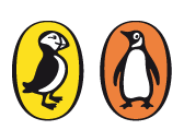
I have recently entered my design for the penguin book awards. The brief was to design a book cover for the book '100 years of solitude'. The design brief takes place once a year giving the designer two different books to look at. I think my book cover turned out really successfully and i have entered my book on the website.
Roses Design Award.

The roses deign awards have yet to release a new brief but i am going to keep an eye on the website to see which ones they bring out this year. Roses Design awards always seem to get really interesting design briefs on their website for students to look at and work too. Because the Design Award has been live for Thirty one years they obviously get a lot of contacts. The competition expands throughout the whole of the English regions and now is the most established creative event outside of London.
Northern Design Company.

YCN - Online Briefs.

DandAD

Tuesday, 5 April 2011
AD108 Art & Design Application - Editorial Design


LIBYA OIL CHAOS.
The brief from AD108 was to design a Editorial piece on a subject chosen from random. My subject was Libya and the Oil Chaos. After a lot of research into my chosen subject I looked at many different editorial pieces and spilt up one piece in particular looking at all aspects of it. I then looked at different editorials and compared them in the layout and page furniture etc and by this time I had a good idea of what I wanted to create. I then followed this up by finding some illustrations and pictures I could add to my editorial and produced a large-scale illustration and photographed an image of the globe whilst tipping Ink onto the top of it and avoiding Libya. This worked really well and then I followed up by finding a few images that worked with the piece. Next I searched for body text and text that relates to the editorial I am doing and I think I found the perfect piece. Finally I needed to look at layouts and the way I could set up the editorial and I think this was the key point in my whole design.
First of all when looking at my editorial piece I am immediately attracted to the illustration situated on the first page. I think it’s very attracting because of the detail in the photography, I think the colours in the illustration work really well and compliment the rest of the page. Next I would say I am attracted to the headline and the way it stands out from the rest of the page, I think its very successful in bold and it immediately catches you attention. I love the simplicity of the serif typeface and think it really works well with the fine separation line between the headline and the rest of the design. I think the way I have situated the sub header works really well, as it doesn’t take the attention away form the main headline but still plays its part in the hierarchy of information. I think the layout of all of the body copy is really successful especially on the second and the follow on pages as its all set in one format so it will always run at that specific framework for this magazine. I think it looks really effective as it’s very easy to ready and because it makes some sort of shape reading from left to right it seems very appropriate.
The page furniture that I decided to go ahead with works really well at setting the whole design off. It ties in the whole of the design and brings everything together. I think the fact that’s its not in One Hundred percent black means a lot as it keeps it separate from the rest of the design so that it doesn’t take away the main focal point and mess with hierarchy of information.
I took a lot of inspiration from the ‘Empire magazine’, which was all about films. I really considered the page furniture when looking at this magazine and it all works really well when set up together. I think I took my inspiration from the page furniture of this magazine, but I think I have adapted it a lot and made the page furniture on my design a lot better than the one in the Empire magazine. I think it has worked out really successful. I took the grid structure from the empire magazine into consideration but I don’t think it was suitable for the topic that I was given to work with so I completely designed my own new one. I think it does really work well and I think it’s very easy to read; reading left to right, and is easy on the eye. I think I have really excelled myself in the grid structure and it has all came together really well. The techniques all work really well when they come together and I think it’s really effective. I love the illustration I used on the first page and I think because I created it myself and photographed it I got the best design I could have done.
Also I took a lot of inspiration from the magazine ‘Horse and Hound’. I think the reason I thought this magazine was so effective is because the grid structure, page furniture and main focal points always stay in the same place and the trend works well through out the whole of the magazine. I think if I was to produce a whole magazine then I would also run the same trend because of how appealing it is and it keeps the whole magazine tied together and immediately recognisable. I think another way of keeping the whole magazine connected and looking like a magazine rather than a lot of individual reports are to work well with the colour, or the layout of colour. So having two pages in the editorial grey on my design could lead to having two pages black on the next report. I think it works really well the way I have set up the colour pallet with reflecting colours used for text.
The way I set up my sub header has worked really well with the main type being in bold then the follow up header being on the line below. I took this from one of the magazines I looked at in my research. Most of the time sub headers are in some form of paragraph or sentence but I thought it looked a lot better as just a key statement to lead into the rest of the report. I think it my sub header is possibly the key part of my design as it is very recognisable and easy to read and is one of the things that immediately stand’s out of the page when you initially look at. I also really like the page breakers before the start of the report with the reporters name at the top of it. I think it works really well at starting off the whole editorial and setting the page off.
If I was given more time to do this project I think I would have worked a lot more on the layout of the first spread so their wasn’t as much type on it as I think it does look very busy but the piece is about the news and something very serious and when looking at magazines in this particular niche they all seem to be very text based and not a lot of illustration. I looked at this magazine and it is a fine example of a news magazine.
In conclusion I think my design is really well executed, as I don’t think I was given the best piece of news to deal with, how ever their was an awful lot of information to source and look at and I think I have created a very professional, smart, and sophisticated final piece. I think all of my piece comes together very successfully and works really well as a final. I could imagine it in some sort of new magazine and I think the follow on page works really well and the whole grid structure could work really effectively throughout the whole of the magazine.
Subscribe to:
Comments (Atom)